Walking out of Union Station onto Front Street, the Royal Bank Plaza isn’t hard to miss. Clad in 24-carat gold reflective glass, its two towers illuminate the downtown Toronto skyline, attracting the attention of financial companies and law firms for more than 40 years. Now, the complex is looking to entice a new generation of tenants: small- to medium-sized tech companies that could one day become the next Shopify.
“Banks do a considerable amount of leasing in downtown Toronto, but it’s the tech companies that are explosive,” says John Peets, vice-president of leasing for Oxford Properties, which manages Royal Bank Plaza.
More than one third of downtown Toronto office demand is coming from this sector. As research from the 2019 Toronto Employment Survey indicates, tech jobs are way up. They jumped 85 per cent since 2014. More recently, Toronto was ranked as the fourth top market in North America for tech talent, according to CBRE’s 2020 Scoring Tech Talent Report. The pandemic is further pushing this industry to new heights, with various tech sectors rising in importance.
In turn, traditional landlords are considering new types of offices with a variety of flexible settings. Earlier this year, pre-pandemic, Oxford approached Toronto-based designers and contractors and asked them to team up for an “Iron Chef meets Homes on Homes” competition. The goal was to create individual workplaces on the 10th floor of the North Tower. In what seems to be a Toronto first, each of the four teams were given a random space with mechanical and electrical infrastructure and a budget of $120 per square foot for an eight to ten-week build-out. Tasked with manifesting a design and furniture solution that would meet the criteria of flexibility, efficiency, aesthetics, sustainability and wellness, the offices had to be innovative yet leasable.
The results challenge traditional views of what an office in the financial district looks like, while embracing shorter lease terms. It’s a combination that works for a tech company unsure of its business plan 12 months down the road, let alone five years, says Peets. Subsequently, the flexibility aligns with what is also a new path for companies as they think about easing into office space during a pandemic.
“Many people look to the office as an extension of their social life since we spend most of our lives working,” he says. “So, naturally during these times, people are pining to get back to the office, (once it’s safe to do so), working face to face with their coworkers and being more productive than what is presently the case.”
Here, the four design teams discuss the vision of their workplace layouts and the flexibility of the design.
Waste Free and Flexible
District One: Connect Resource Managers and Planners Inc.

Named the winner of the competition, Connect was selected for its efficient and sustainable design. With a desire to rethink the definition of a flexible workplace, the team created a concept they called “the Puzzle”—four potential layouts that are reconfigurable.
Moveable panels wrapped with either a writable surface or tackable cork slide along an overhead track system to partition the open space into smaller areas. Furniture on wheels and folding work surfaces can be sorted together for teams of various sizes. Adding an industrial flair, power sources dangle from the ceiling above—not the typical and costly floor monument solution. “A user may reconfigure their workstation and always have pull down power at their fingertips providing the ultimate in flexible office space” says Intermediate Designer Kimberley Green. “It also eliminates tripping hazards caused by core drill power in inconvenient places when reconfiguring an office.”
By the entrance, a large glass-enclosed meeting room fills with light from the nearby atrium glass. Past there, the suite expands into a variety of workspaces. Efficient plywood and stackable box-type seating, for instance, fits into the saw-tooth configuration of the windows, to be used for more casual meetings or town halls. During construction, the design team also wanted to generate the least amount of waste possible. “We wanted to push the boundaries of the design and really think about the environment first,” says Connect Principal Dave Saunders.
Rather than use traditional materials like drywall to construct partitions, they favoured a digital component construction product to allow for zero waste at installation. Remarkably, by the end of the project, one small garbage bin of landfill waste remained.
Less Polish and More Freedom
District Two: Gensler

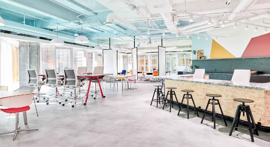
Working with the smallest suite in the competition didn’t stop the design team from realizing big ideas. They created a space that can grow and transform alongside any small company, where every area has more than one function. The office is the antithesis of glossy—a “start-up for the sneakers-and-hoodies intelligentsia,” as Annie Bergeron, principal and design director in Gensler’s Toronto office, calls it. “Innovation doesn’t thrive in spaces that are too precious and polished; it thrives in an environment where people feel they can move around,” she adds. “Nothing was sacred in this space; everything could be challenged and reconsidered.”
Pops of bright colour complement the light-filled office, while geometric forms accent meeting room walls, charging those spaces with creative energy. Since many tech start-ups might use a mix of random chairs and desks, the designers sourced only existing furniture from their partner’s basement inventory to convey a “rough-and-tumble” mentality.
A private room offering enclosed, casual meeting space—also where the competition jury chose to deliberate— doubles-up as a wellness area, purpose-finished with a couch and blankets. Other areas are more open and dedicated to team-building. “For a young start-up company, the best way to attract and retain talent is to supercharge their cultural growth, and the best way to do that is by having a social space,” says Bergeron.
To elevate this idea in the workplace, a barista bar and reception counter is at the heart of the office, to be used for morning scrum meetings or a place to pop open chips or drinks on a Friday, promoting face-to-face interaction. As the company grows, the counter could transform into a reception desk, yet remain a hang-out place for employees. “Our research shows that teams who trust each other and have the highest levels of trust and empathy for one another are also the most innovative,” Bergeron adds. “Every aspect of this office was geared to provide tools for innovation.”
Calm and Functional
District Three: Ray Inc.

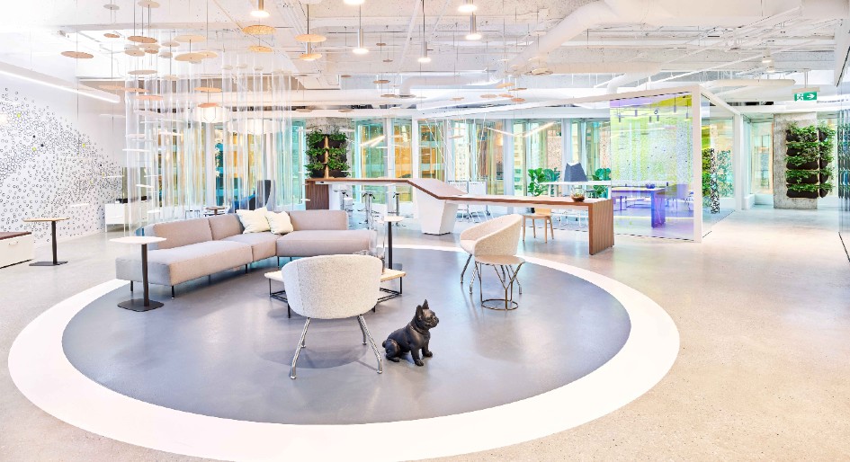
With wellness and a human-centric approach in mind, circadian lighting was a revolving aspect of the design. A product made with quantum dot technology, one offering the most accurate simulation of sunlight available on the market, was integrated and custom made into light fixtures for the space. The office is first to use this circadian formula, developed by the WELL Building Institute Standards team.
According to Tulin Artan, associate and design director at Ray, regulating your circadian rhythm boosts productivity, energy and mood. As the lighting adapts to an occupant’s circadian rhythm, the user can adapt to the workplace. Adaptability has been proven to contribute to a person’s sense of comfort
Emphasis was placed on individual flexibility, with an array of multi-functional spaces, from lounge areas to mobile tables and sit-stand workstations. Workers’ physical needs change throughout the day, so providing choices was also key to the design, which relates back to well-being. “Not everyone can work in an open office, so having a variety of workspaces to suit those different styles is so important,” adds Artan. “What makes the open space successful is providing a private oasis and rooms where workers can step away from the open plan.”
Well-being was further realized through biophilic design principles. Patterns found in nature enliven the room, both visually and subconsciously. Art, lighting fixtures and decorative panels feature circles or vertical stripes—sequences based on the building blocks of nature. They are also made of colours and materials that hint at nature, such as wood. A white, rock-like motif adorns the wall of a decompression room where preserved greenery hangs from above.
Both calm and functional, light and airy, it’s a space where employees can have down time and also access tools to foster productivity. “It was about satisfying the physical, cognitive and emotional needs of the employee to make it a healthier workspace, addressing those items, not just the aesthetic,” says Artan.
Free Flowing and Multi Purpose
IBI Group – District Four

When the designers set out to create this office space, they did so with a digital avatar in mind—a female entrepreneur with a fashion start-up, growing out of her home office in the Queen West neighbourhood and in need of a downtown office with new talent.
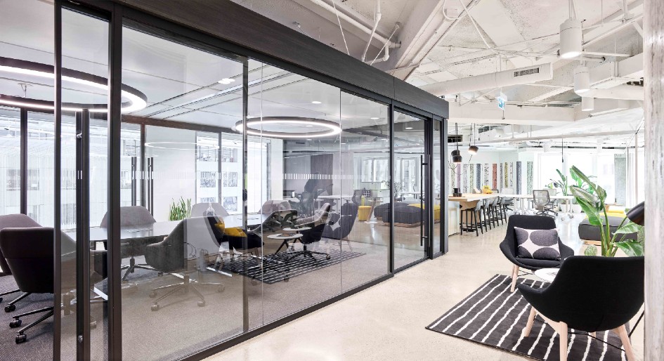
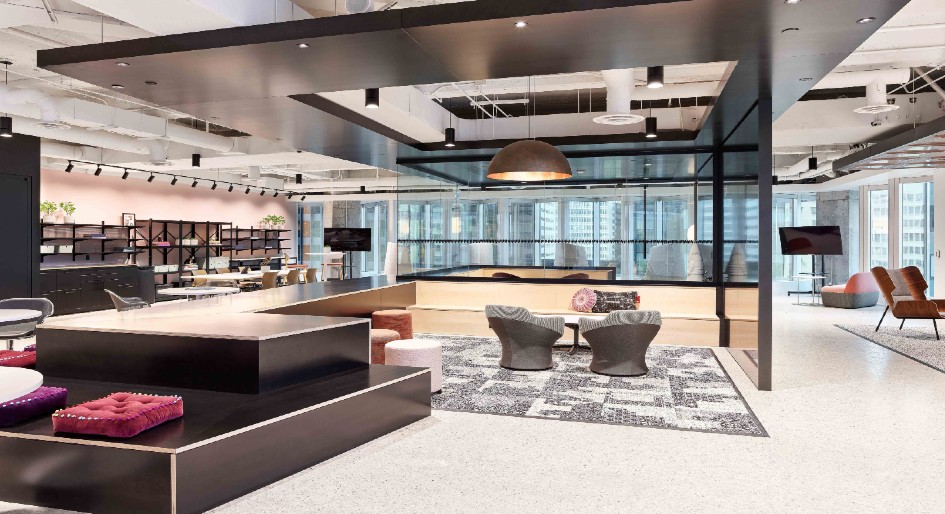
Emerging from that idea is an open workspace for collaboration and respite. A glass-encased central pavilion—featuring a semi-amphitheatre—invites people to congregate for town halls or meetings. Around the periphery, different areas reflect the flavours of home. Neutral and berry tones dot the multi-purposes spaces: a park, a library, a decorative floral rest zone that transforms into collaboration space in a matter of minutes. Grey chairs tuck into the saw-tooth window configuration of the building, transforming the jagged spaces into individual quiet zones that muffle out noise.
“Typically, offices tend to be developed from everything being on the outside with people working in the middle,” says Joe Pettipas, senior practice lead, interior design. “In this office, all people work on the outside and come to the middle to gather. We wanted to create an environment that was non-traditional and uber-flexible.”
Such a layout echoes a new generation of workers with changing needs. “Flexibility being key,” says Pettipas, “but also this whole idea behind purpose-built space having no purpose. Not that it doesn’t have a function, but that it can support any function. A space where employees can readily invite their customers to brainstorm and work on solutions.”
It’s an office that could support a variety of work styles. “It’s not something you’d expect walking into an office in downtown Toronto with high rents,” says Peets. “Here, value is placed on the real estate.” He adds, such a space would normally be densified with as many workstations as possible, rather than free-flowing and flexible to the users’ needs.
For Jane Juranek, manager of interior design, creating the space in the Royal Bank Plaza has been a future-forward opportunity. “Testing out this floor with community space is allowing different industries to fill the core,” she says. “We know the generation out there is tech-savvy, but they still want to live downtown, walk to work and not depend on cars. I think this is a really exciting step forward.”
Canteen – Britacan Facilities Management Group
All four offices are privy to the communal Canteen, a 15,000-square foot area for eating, working, socializing and events. The design had to consider all four tenants on the floor, so creating a shared common space was challenging. The idea was to be more neutral and consistent throughout, with no one suite in mind. “Our vision was to consider an open seating concept, but without looking like a typical brick-and-beam building,” says designer Oliver Tan of Britacan Facilities Management Group.
Sophisticated materials create a rough and refined space with a flexible, community neighbourhood-feel. Communal tables, booths and high bar stools nudge employees to leave their desks and walk around, a critical aspect of employee well-being. “It’s wi-fi enabled and intended for people to break-away from the office,” adds Peets. “People can take their laptop into a different setting, resembling a Starbucks or a cafe where remote workers would work offsite.”
An elevator lobby, also designed by Britacan, is another space on the 10th floor, with dramatic patterns inspired by the zig-zag perimeter glazing of the building itself.


