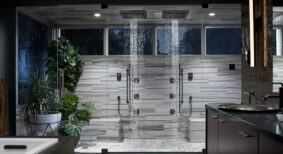
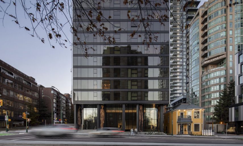
The Pacific, a residential tower by ACDF Architecture, reflects the firm’s evolving approach to developing high-rise buildings entrenched in the public realm.
Located at the corner of Hornby and Pacific streets, in a cityscape framed by the Granville Street and Burrard Street bridges, The Pacific features 224 condominiums across 39 floors. The building was developed in collaboration with IBI Group, a Canadian architectural consulting firm, for Grosvenor, a private real estate group.
“Grosvenor is very respectful and refined in its embrace of quality, but also in its deep consideration of the impacts that its developments have on surrounding streets and neighbourhoods,” explains Maxime-Alexis Frappier, partner and co-founder of ACDF. “We wanted to propose a different approach in the form of an urban gesture that contributes something much more than just a building.”
Quiet distinction
As one of several new additions to the Vancouver skyline, The Pacific has earned its place alongside cutting-edge buildings designed by some of the world’s most renowned architects. Rather than competing within Vancouver’s already dense and varied landscape of tall buildings, ACDF adopted a more complementary approach, prioritizing clean, subtle, and human scale elements to provide a wealth of urban experiences among the more dramatic architectural gestures of neighbouring buildings.
“A philosophical alignment with the client provided us with the freedom to express our belief that sometimes quiet and humble architecture can be even more elegant and relevant,” says Frappier. “Our role was not to create noise, but rather to provide our building with a quiet, but recognizable identity.”

Human-scale dialogue
That approach began with numerous elemental considerations, including a strong focus on creating a dialogue at street level with the neighbourhood and its pedestrians. They focused the development of shape and form on simple massing that would capture attention through its textures, the quality of its assembly, and the transposition of its details. The firm envisioned a structure whose materiality would emit its own unique character, while blending into the built, environmental, and social fabric of its surroundings.
The Pacific is a visual landmark devoid of sculptural drama. Vertically, the structure’s slick north and south facades, layered with glass and black granite, contrast with its more pictural east and west facades, with the latter featuring protruding triangular balconies in a woven pattern.
Taking a sensitive approach and putting people at the heart of all its design decisions, ACDF Architecture made an exhaustive study of all components of the project that could have an impact on the immediate area, its residents, and passers-by: general volumetry, materials (tonality, reflectivity, durability, etc.), shadows, winds, and the obstruction of existing views. Accordingly, the east façade of the tower, for instance, was designed in consideration of its west-facing neighbours, while the omission of balconies on the building’s north side was purposeful in order to prevent direct views between neighbours. In giving careful consideration to each façade of The Pacific, the architects quickly realized that the pedestrian view at street level alone formed a new perspective, or a ‘fifth façade’.
The ‘fifth façade’
At its base, The Pacific is grounded to the site’s location, its history, and the vibe of the street, not just in terms of materials, but also in terms of how the building would be viewed from the ground up.
“While the allure of traditional skyscrapers often fades with closer proximity, we created a ‘fifth façade’ for The Pacific in the form of vertical views provided through strategically positioned design elements,” explains Frappier. “You can look up from the street level and discover a new skyscraper language in the form of new relationships between pedestrians and the building.”
From its street-level base, vertical views are enriched by balcony textures, including three tones of grey on their undersides, inspired by cloud formations and creating a sense of movement within their patterns. The triangular balconies above also provide plays on reflection to the streets below. As the sun sets on the city, the building begins to glow, reflecting light downward from the white, marble-like porcelain finish of the balconies, as well as a pinkish hue that emanates from the stainless-steel framing. During those transitions of light, two facades begin to glow, while the other two sides fade to darkness.
An integration of art and heritage
Leading up to the entrance of the tower, ACDF designed a long, dramatic colonnade. Its oversized, angular columns are purposefully misaligned, providing Vancouver-based artist, Lyse Lemieux, with a blank canvas upon which to pay homage to the site and its history. She subsequently developed a mosaic composition of nine figures, each more than 20 feet in height. Each of the columns faces in a different direction and features a different personage, creating a sense of movement and delivering a strong contribution to the neighbourhood, the public realm, and the city. The columns also transition into the fully glazed lobby and remain the main actors that animate the space’s minimal, simple, and toned-down design, featuring black brick walls, in a grid pattern, and stainless-steel finishes.
“From the beginning of the design process, we focused on developing a tower whose contribution would extend from the skyline right down to the micro level,” explains Frappier. “Our intention was to positively impact the animation of the area at street level by establishing meaningful connections between the building, pedestrians, and residents. Lyse Lemieux’s extraordinary artwork on the ground floor colonnade succeeds in capturing the essence of that intent.”


