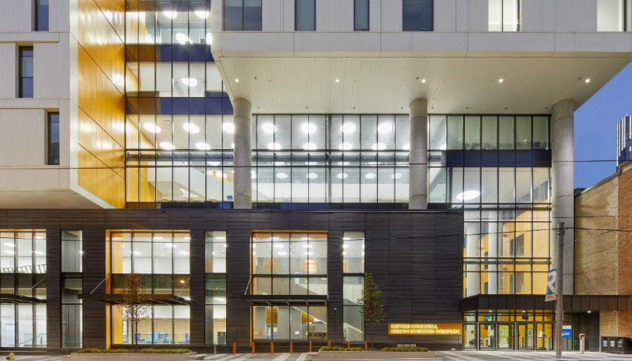
Dingy is a word that conjures thoughts of old institutional spaces. Academic buildings with dimly-lit hallways and windowless classrooms punctured with fluorescent glare. Rarely are campus facilities the pinnacle of health and wellness.
So, when Ryerson University decided to co-locate the School of Nursing, Midwifery, Nutrition, and Occupational and Public Health, “wellbeing” wasn’t just a design goal, but a way for students and faculty to actually practice healthy behaviours.
The nearly 300,000-square-foot Daphne Cockwell Health Sciences Complex, which rises 28 storeys and blends an 18-storey student residence with an eight-storey academic podium, administration offices and research facilities, was completed in 2019 at $104-million. It recently won the 2021 Best Tall Building Award by the Council on Tall Buildings and Urban Habitat, an industry accolade that recognizes the top echelon of sustainability and wellness.
On the campus’ eastern edge, around the corner from Yonge and Dundas Square, the LEED Gold tower stands on the grounds of an old parking lot, clad in white aluminum panels and accented with vibrant orange.
The idea of bringing the Faculty of Community Services together under one roof was meant to evolve a shared culture around holistic health. From there, came a vision to spark social connections and pedestrian movement throughout the design process led by Perkins+Will.
For instance, a series of atria connecting to stairways in two-storey increments was designed to be inviting and manageable. As Perkins+Will Design Director Andrew Frontini explains, “it’s about getting people to move up and down a couple of floors by creating an interesting journey through the building—getting people to interact.”
Nic de Salaberry, director of planning and development at Ryerson, notes that the natural light and artistry of the stairs entices people to forgo the elevator if they are able. “We’ve spent a lot of time taking care of our 80 elevators on campus,” he says. “Anything to encourage people to take the stairs also helps make the elevators perform better and reduces energy use.”
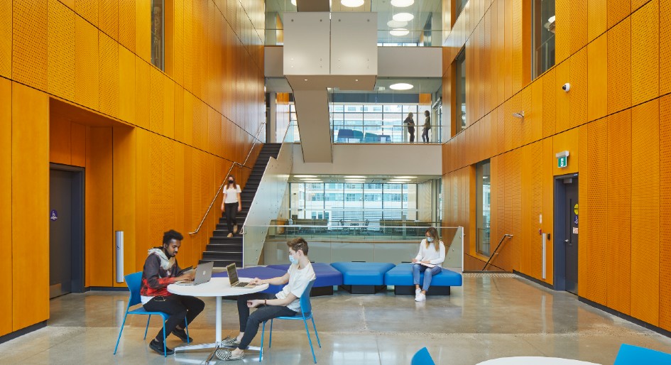
Stairways lead people to a series of atria and spark social connections. Photo by Tom Arban.
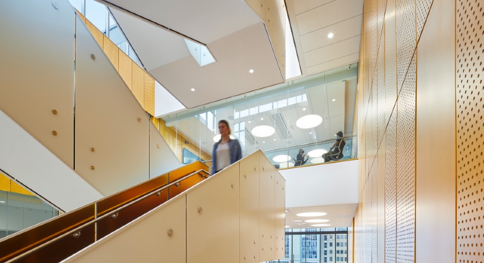
Photo by Tom Arban
All the building materials were screened through the lens of human health, reflecting ideas intrinsic to the faculties within this active environment.
“Nurses and midwives are talking about health delivery in different ways, and then the building is offering, as a backdrop, an approach to health,” says Frontini. “The way this manifests is through healthy specifications—what the building is made of influences occupant health itself.”
Perkins+Will referenced its own database of hazardous and harmful materials, dubbed the “Precautionary List,” which looks at 25 chemicals in everything from sealants and upholstery to antimicrobials and fire retardants. Designers worked with the school’s purchasing department to create a document that can be integrated into future building specifications.
“Ryerson became ‘a research project within a research project’ in a way,” adds Frontini. “They are always doing a series of small renovations—if they can bring those specs into play in every project, then over time, it’s going to lead to a much healthier set of environments.”
A living lab
Indeed, much of the building is like a living lab. In the 332-student residence—divided into houses, each taking up two floors and sharing a lounge and residence advisor—a metering and monitoring system allows students to view their energy and water consumption online.
It’s a relatively novel feature within campus settings. In Frontini’s view, if each house displays its water and power use on an interface or through an app, they can build a competitive culture around driving consumption down. “The idea is people come into residence and develop an awareness around sustainability and health that will shape the rest of their lives,” he says.
Despite the interruption of normal occupancy (currently at one-third) that vision has yet to fully unfold. The hope is that it will ultimately inspire future campus buildings. During the initial stages of the project, the university didn’t have a consensus on how its facilities and their various spaces performed—a lab versus a gym, for instance—and no real data and benchmarks to target.
“They started to think of this building as a kind of laboratory or data collector for them to create a baseline,” says Frontini. If aggregate can be gathered from metering the various spaces separately enough, he adds, the school can begin to build data sets that inform how to use, plan and design buildings.
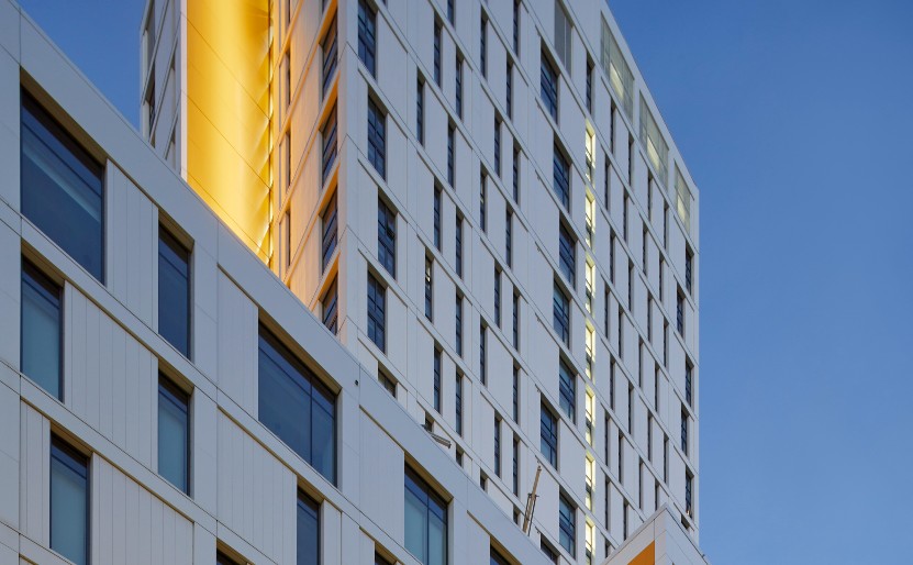
A 18-storey residence houses students from all programs across campus. Photo by Tom Arban.
Currently, there are roughly 1000 data points installed. “It’s a very complex building, so for them to have that many data points available is quite exceptional,” adds de Salaberry
Other sustainable features, such as a rooftop urban farm, provide fresh produce to the ground-floor cafe, a greywater system for faucets, toilets, and showers, and a place to pause outdoors. All the teaching spaces are infused with natural light.
For heating and cooling, 100 per cent fresh air is welcomed through an active chilled beam system. As Frontini explains, the air moves through a heat recovery wheel before it enters the spaces and also before it leaves the building, so the heating and cooling energy is never “thrown away.”
“People always think about getting fresh air from opening a window, but at Church and Dundas the air outside is probably anything but fresh,” he says. “This is air that comes in, gets filtered, gets conditioned, gets delivered to you. That’s much healthier than getting a bunch of car exhaust.”
Maintaining identity
As is the case with anything new-ish to academic settings, program elements brought technical hurdles, “some convincing,” and lot’s of research and case studies. Mixing programs also came with a unique set of challenges in regards to developing excitement around co-location.
Midwifery, for instance, would be moving in with the much-larger School of Nursing and didn’t want to “get lost in the mix” or feel that interests weren’t met in the design process. “Everyone kind of wants an address,” says Frontini. “They’re used to having a nice little reception area and then the spaces are them; they have their own culture and people.”
To maintain that identity without siloing programs, users come together in public spaces and shared areas like a cafe and clinical suites where they practice clinical examinations. “It’s kind of like they each have their own house but then they come out into the street and they both go to the shared parkette,” Frontini analogizes. “It’s a balancing of synergies, but everyone wants their own discreet space they can control.”
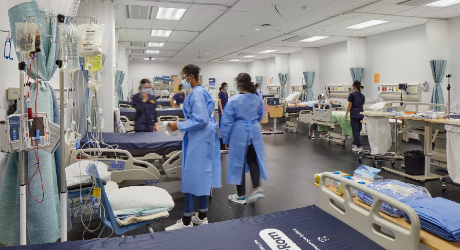
Clinical learning spaces bridge students from various programs. Photo by Tom Arban.
As the building rose, complex structural systems had to support the residential tower’s uber-concentrated vertical loads on top of open, column-free classrooms. Adding two mechanical plants took coordination to appropriately direct services, but will consequently prevent large air distribution ducts from running down through the residences.
Aesthetics was another concern from the get-go. As Frontini says, “they didn’t want it to look like a condo with some retail on the base; they wanted it to look like an institutional building. That meant coming up with one architectural image for both the residence and academic components.”
Colour, massing, and window design create a seamless expression for two very different building types—a fairly uncommon mix. “If you look across Canadian university campuses, you will find very few examples of student residences on top of academic podiums of this size,” says de Salaberry.
When it came time to select the site, cost and space constraints figured prominently, as did efficient land use and a vision to animate the neighbourhood. “Having more people living on and near the campus makes the campus more vibrant, more welcoming and I think a more attractive place for everyone,” adds de Salaberry. “Some people would say it also makes it a safer place for people, too.”
City builders
The fully-glazed podium holds almost 175,000 square feet of classrooms, labs and program space, such as a demonstration kitchen for nutrition students and practical nursing labs that replicate hospital wards.
Located in the basement, above four levels of underground parking, a 7,500-square-foot digital fabrication space is a place to prototype ideas and serves as an extension to the nearby digital media zone—a globally recognized think-tank for digital entrepreneurship.
From the outside, an interior street meanders to a back laneway where students can view high-end robotic arms at work in the two-storey space as they lock up their bikes or as they head indoors through the west entrance.
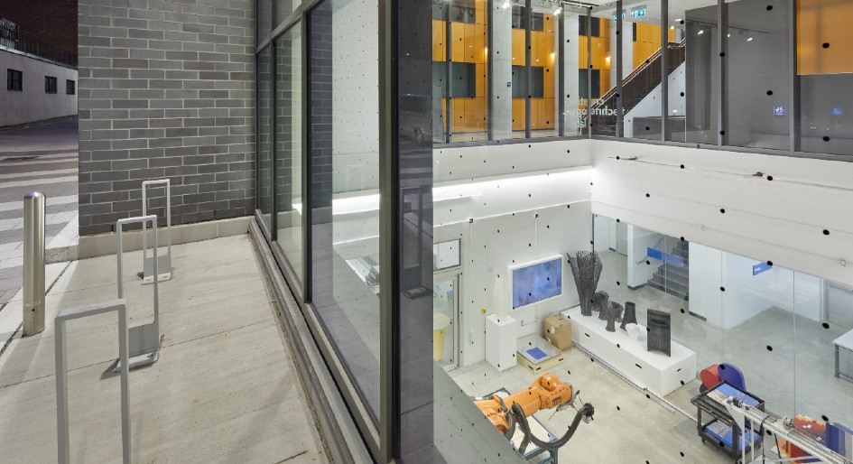
A digital fabrication lab enhances the public realm.
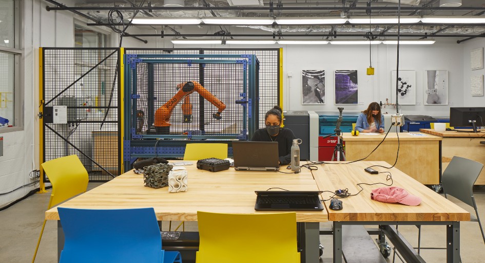
Students at work in the digital fabrication lab. Photo by Tom Arban.
This is but one example of the kind of pedestrian connections the City of Toronto encouraged through the zoning process. Passersby on Church Street can observe students socializing and studying as large windows of the atrium enhance the public realm
What makes this a great campus building is what also makes a great city: not just higher density and mixed-use, but life on the street and Jane Jacobs-style casual encounters.
In that sense, the project echoes what the campus’ 2008 master plan set out to do: create dynamic public spaces, landmark design and urban resilience—all helping to shape the future of Toronto. And while placemaking efforts to transform the area have been a feat for the university, the same goes for residential developers who are buying nearby land and looking at the school as an amenity.
“That way of looking at Ryerson as a city builder – that’s a fairly recent story,” says de Salaberry. “The story about this building doesn’t just unfold inside; the story takes us out of the building and into the streets—to the neighbourhood.”
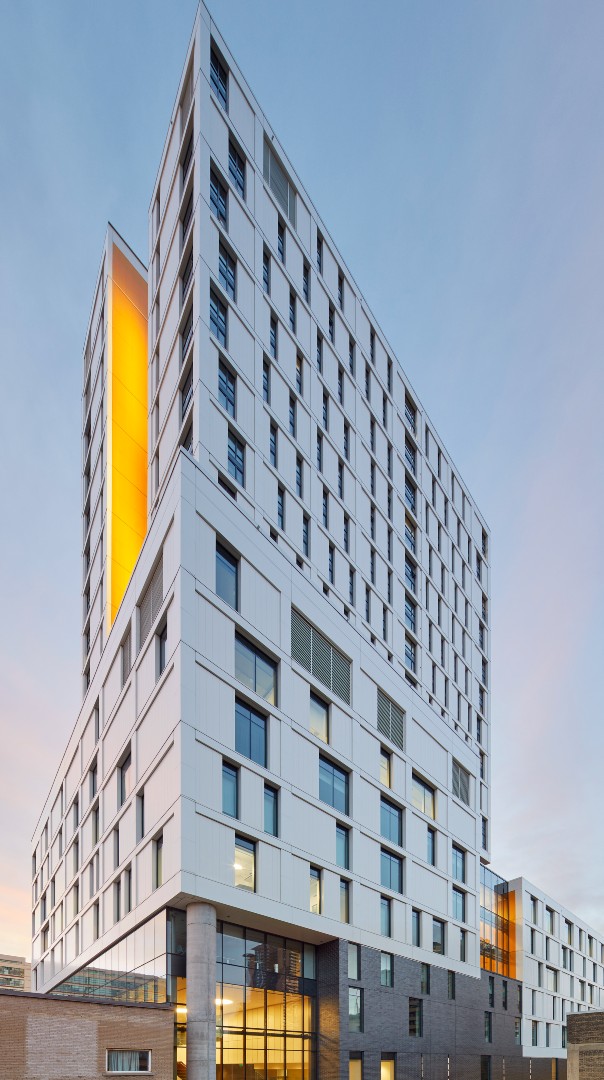
Photo by Tom Arban.


