Whether it is for an annual appointment or an emergency, the average hospital patient feels a surge in anxiety as their visit approaches. There are many uncertainties, such as the cost of parking, how they will find their appointment location, and how long they will have to wait.
Especially in larger hospitals, navigational problems are a common complaint. Hygiene requirements mean furnishings and decor are kept to a minimum, and a labyrinth of corridors becomes a maze past stainless steel elevator banks. Everything looks the same.
Getting lost can be catastrophic. Studies have shown that arriving late or missing an appointment imposes huge costs on the system. Newcomers to Canada have the added barrier of language difficulty, and while most newly constructed hospitals incorporate digital signage into their construction budget, existing infrastructure is often left behind.
Older Hospitals in Need of Funding
As hospitals age, most will build additional wings and units to accommodate the changing needs of their community. Scarborough, Ontario, has three publicly funded hospitals that were built in 1985, 1967, and 1956. However, there have been no recent major infrastructure upgrades in any of them. The operating room at Centenary Hospital is one of the oldest in the province and has not seen an upgrade since being built in 1967.
According to the Love, Scarborough campaign launched by Scarborough Health Network (SHN) in 2022, ‘Scarborough’s population is made up of 73% visible minorities when compared to Toronto at 51%.’
Despite representing 25% of Toronto’s population, Scarborough receives just 1% of hospital donations.
Scot Martin, President & CEO of youRhere, believes that upgrading navigational services within older hospitals would significantly improve the patient/visitor experience. “We need investment in these older hospitals facilities even more than the new ones,” he explains.
As the campaign asks, “Is it fair that the newest to Canada are forced to go to the oldest hospitals with aging infrastructure?”
Digital Signage Breaks the Language Divide
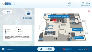
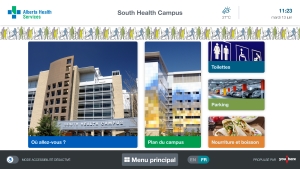
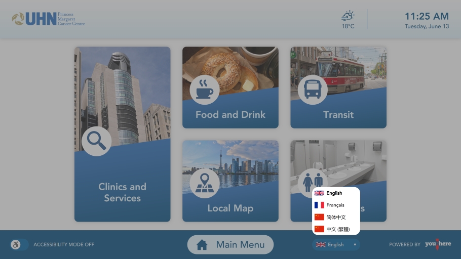
With language barriers particularly evident in hospitals with minority populations, digital information hubs offer a multilingual beacon of light for those trying to find their way, and can visually modernize older, drab buildings. Screens have the advantage of constant availability and provide an alternative to staffed help desks which are often closed during overnight hours or overwhelmed during peak periods.

“We have new Canadians visiting the hospitals where all the signs are in English, and they don’t know where to go. It can be stressful,” advises Martin. “Clientele to hospitals will also include people with various disabilities—whether they are in wheelchairs or have visual impairment—which makes a stressful hospital visit more difficult.”
In the basement levels of a hospital where internet reception can be poor, wireless cellular modems are used to ensure connectivity. “There really isn’t any place in a hospital that we can’t get a signal to,” Martin asserts.
The most common locations for signage are, of course, in the main entrance lobbies, and many hospitals test the success-rate of digital information hubs in these areas. “That at least gets people pointed in the right direction,” he notes. “Later on, the facility will come back and put some on the upper levels.”
Martin expresses that modern digital signage is more affordable than many people think.
“Some people have an inflated view of what it really costs, so instead they’ll add an extra person to the help desk, which over the course of a year costs a lot more,” he says. “There are different financing options available. For a hospital which has room in their operating budget but a limited capital budget, the leasing option is something to consider,” he explains.

Purchasing multiple hubs amortizes the cost, and updates to information can be added without the need to purchase and install additional physical signage.
The digital information hubs take up little space; they can be affixed to walls, embedded in existing help desks, or be standalone units on pylons where the user interface can be lowered to accommodate the mobility impaired. A key feature is the multiple language options featured prominently on the screens. “For someone whose first language isn’t English, they may feel more comfortable approaching a screen,” explains Martin.
QR Code Makes for Easy Travel
Importantly, the screens offer a QR code specific to the area requested, which allows users to scan the information on their personal cell phones, allowing them to take the information with them as they begin travelling to their destination. A visual representation of their journey is more helpful than following relayed instructions, he remarks.
“Someone comes in and they get instructions, but halfway through they forget where they are going. With screens, up will come a map with a QR code. You scan your smart phone and take those directions with you.”
Information from a hospital’s website can be integrated with the screen’s mapping system, and all directions are orientated based on the location of the user making them easy to follow.
Whether you are a patient, a health worker, or a visitor, being able to access information quickly—no matter your first language—is key. For older infrastructure with a limited budget, upgrading wayfinding systems can modernize the navigational needs of patients and visitors and reduce the number of tardy or missed appointments.
Digital information hubs make it easier to get to the destination, to navigate the numerous wards and wings, and to get patients to their appointments on time.
Scot Martin is the CEO of youRhere, a leading provider of digital signage solutions for commercial, retail, healthcare, and educational properties across Canada. To find out how digital signage can help your hospital, visit www.youRhere.ca.


