Earlier this year, on a chilly mid-January morning, a crowd of people gathered inside Michael Garron Hospital to celebrate a ribbon-cutting ceremony for the new Ken and Marilyn Thomson Patient Care Centre in Toronto’s east end. As part of the largest campus redevelopment project in the hospital’s history, the eight-storey facility was about to open the following week and usher in a new era of healthcare.
Standing at a podium, Former Mayor John Tory shared what it meant for more than 400,000 residents of the diverse East York community, many who face increasing health and social care needs, “many who have been newcomers with different experiences overtime of the healthcare system,” he said. “Many people [with whom] you have to earn trust and form different kinds of relationships.”
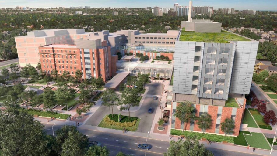
The 550,000-square-foot facility broke ground in 2018 on an old parking lot, and was designed by Diamond Schmitt, B+H Architects and CannonDesign. The Ministry of Health, Infrastructure Ontario and EllisDon partnered on its construction.
“Having had the chance to be part of the project from the onset, I can say that community engagement has been integral to the project’s development,” Ilinca Popa, healthcare architect and senior associate with B+H, shared in a recent correspondence with CFM&D. “From open houses, to mock-up engagements, to events held in the nearby farmers’ market regarding furniture selection, they have all been instrumental in hearing the diverse range of voices in the community.”
Design features of the tower incorporate community-specific elements. The facades are integrated into the scale of the neighbourhood and adjoining houses. New interior spaces reflect the unique characteristics of the population itself.
Due to the area’s higher occurrence of chronic disease than the Toronto city average, three of the hospital’s largest chronic illness outpatient programs converge together within an easy-to-access chronic disease unit.

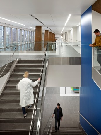
Wider corridors filled with natural light to boost healthcare delivery. Photo courtesy of B+H Architecture.
Also in the three-storey podium are outpatient clinics and an ambulatory procedures unit for minor care, the Moez & Marissa Kassam Food Court for families to relax together, centralized patient registration services, and a lobby brimming with natural light.
“The entire entry sequence, with an ample lobby area and double height, acts as a gathering space, extending the spaces available to the hospital for large events,” says Popa. “This was purposefully thought out during the early stages of the project.”
Throughout the other storeys are the Carswell Family Medical Education Centre, with classrooms and living quarters for on-call residents, and a simulation centre to further train health care providers.
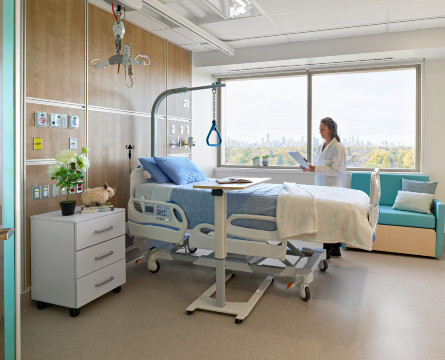
Acute care and two inpatient mental health departments are much-needed additions, with 215 new in-patient beds, 80 per cent of which are private. All patients, even those in double rooms, have their own private bathroom and a pull-out couch or sleeper chair for family and friends.
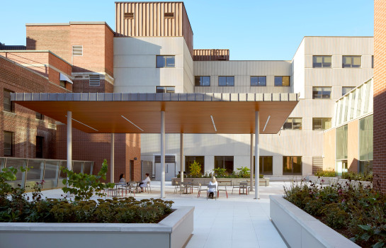
The healing journey extends to spacious outdoor areas for both patients and staff. Designed as a cascading set of terraces, the green space acts as an extension of community outdoor amenities, says Popa. “This vision was very well articulated from the beginning of the project, and it emphasizes the important role the hospital will play in the community and how the outdoor space will create opportunities for gathering and children’s play.”
How nature aids in the recovery of mental healthcare users has long been praised as a primary element of such complex environments. Built between wings of the existing hospital in a phased approach, the outdoor space includes the staff and visitor terrace, but also a mental health patient terrace.
“The mental health unit is one of the most interesting units in the hospital as it had to respond to several factors,” Popa explains. “First, the team has aimed to create spaces that destigmatize mental illness and disorders. Second, the unit design had to accommodate a Psychiatric Intensive Care Unit, an adult acute unit, and a dedicated zone for elder patients with onset of dementia all in one racetrack unit.

An outdoor courtyard for staff, family and patients. Photo courtesy of B+H Architecture.
The design team aimed to create flexibility all while respecting the flows and dignity, not only of the patients, but also for staff,” she adds. “There are many ways to address the needs of patients, but it’s also critical that we address the needs of staff in these environments and ensure they have spaces for breaks and rest.”
The vision transpired with help from a supercharged donor system. The Heart of the East capital campaign raised more than $100 million over four years, including 28,281 pledges inspired by Peter and Diana Thomson. Overall, the campus project brought in $498 million from donors, the hospital and the Ministry of Health.
With updates to the existing hospital underway until 2024—this includes decommissioning of outdated wings and new greenery and landscaping,—the new tower is already reflecting a future-forward vision.

A private room inside the Ken and Marilyn Thomson Patient Care Centre in Toronto. Photo by B+H Architects.
Looking ahead, Popa notes how design will be experiential and focus more on the user experience. “The future of hospital design will also focus on adaptability of the built environment as we progress our thinking towards a more resilient and sustainable future.”
Before COVID-19, the project team, including MGH’s Infection Prevention and Control team, were already mindful of integrating pandemic and disaster management requirements.
“They proved invaluable when thinking about the future facility design and future proofing of healthcare in post-pandemic times,” she says. “The design includes a lot of flexibility in use. This includes a dedicated inpatient pod that can be isolated during a pandemic, an ambulatory care area that can be operationalized during a pandemic, and entrances that clearly separate the flows of patients and staff, limiting unnecessary interactions.”
Back in January, before opening day, Shelley Darling, chief of operational readiness at Michael Garron Hospital, stood in a bright new corridor and shared how a very detailed and coordinated process was in place to smoothly transition patients and staff from some of the oldest parts of the hospital to brand new spaces.
Her team led the logistical planning for the move, which involved a proactive and comprehensive training program for staff to ensure teams were comfortable working in the new facility. Workflows were tested and new travel routes inspected to counter potential issues once patients were welcomed in.
She said the new tower is a big improvement. “The windows and natural light are so conducive to healing and that in-patient experience is so much more improved in this facility,” she shared. “Our staff benefit from that as well; it has improved and increased space in the rooms to provide care, but also at their team stations where they can collaborate, either through conversations or through technology that has been enabled in this building to help improve care.”


