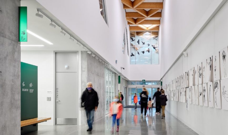
Designing the Clayton Community Centre to become Passive House certified for ultra-low energy use was no easy feat, especially since the international standard had never been pursued for this type of facility in North America.
Also the largest non-residential project on the continent to achieve the designation, architects behind the 76,000-square-foot building in the Clayton Heights neighbourhood of Surrey, British Columbia, came to realize there were no precedents to refer to when faced with design challenges.
Most Passive House-certified buildings to date—1,965 globally and 124 in North America—are living spaces. This has been the reality ever since the standard was formalized in Germany in the 1990s and rolled out in Canada in 2010.
Melissa Higgs, principal at hcma, the lead firm on the project, explains that determining energy usage and related electrical loads was a daunting task, as this data is more predictable in a home environment. The Clayton Community Centre operates daily diverse programming for long hours, including music studios, a community rehearsal hall, a gym and fitness centre, a tool shop, a community kitchen and a branch library.
“It was very challenging to ask the client in the early design stage what classes they were going to offer in this building; all the things they were going to plug into the wall, how much equipment in the fitness centre,” she says. “Every hour of the day had to be understood.”
In B.C., a climate-related issue with residential applications is retaining heat inside a home through insulation. But due to the high number of people using the community centre, cooling became the larger, unexpected obstacle. “The heat of people’s bodies alone was enough to heat the building all year round,” says Higgs. “All of a sudden, we had all this energy that was required to cool it.”
Motorized clerestory windows open up to release the heat at night and bring essential cooling. During the day, natural light is filtered through for a dappled effect— like sunlight through trees—while reducing reliance on electricity.
The centre, which officially opened in October 2021 on a budget of $42 million, ultimately reduced energy consumption by 72 per cent compared to the average performance of similar existing buildings in the province, and cut carbon emissions by 98 per cent compared to others like it built to ASHRAE code.
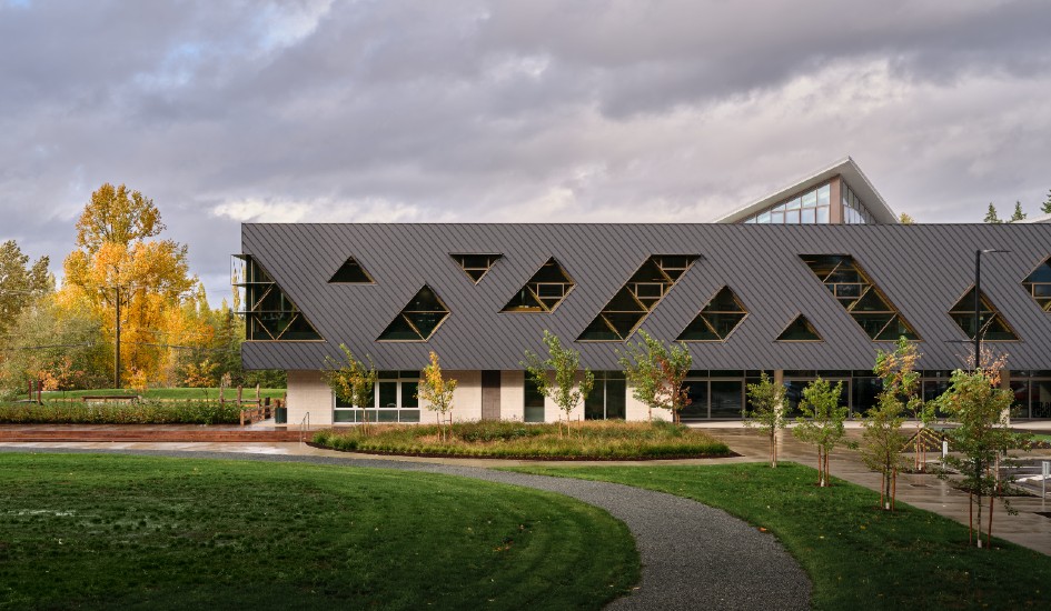
The main entrance of the Passive House facility. Image by doublespace.
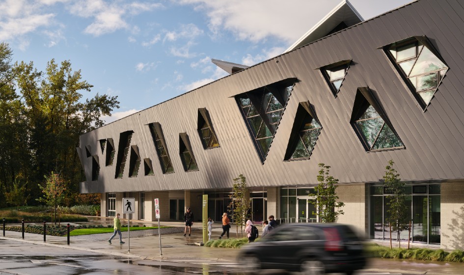
Motorized clerestory windows on the exterior bring in natural light and open in the evening to cool the building. Image by doublespace.
Envelope efficacy and quality control
Making the external envelope of a building as airtight as possible is crucial to Passive House success and is a component that long-term owners and operators should carefully consider, says Higgs. “Mechanical systems fail and change. It makes a lot of intuitive sense to be investing the money into the envelope.”
The rigorous air tightness requirement that comes with Passive House also requires a high level of on-site quality assurance and control. For this project, all trades were expected to understand every step of constructing the envelope.
As Higgs explains, ”you can’t pop a screw through the air barrier.” That causes a leak; too many leaks could mean not achieving the air tightness requirement. Contractor Ellis Don created a one-to-one scale mock-up of a section of the building to test drive how each trade would finish its task before the next trade arrived.
This higher level of on-site quality control is one reason why green building advocates praise Passive House, with many forecasting more uptake among institutional users.
“It’s a huge and valuable tool in the arsenal to address climate change,” says Higgs. “I’m hopeful we’ll start to see it embedded in code requirements, but I think public institutions need to be the leader with things like this. The City of Surrey paved the way for others to say that this is possible.”
Designing for social impact
The Clayton Community Centre is the first building to test hcma’s homegrown social impact framework, which is based on principles of equity, social inclusion, sustainability and adaptability.
“We know there are all kinds of ways we can measure the technical environmental performance of buildings, but especially in community facilities, for a long time, we’ve been interested in measuring social outcomes related to facilities,” says Higgs.
The framework informed how deeply the community was engaged, leading to extensive conversations around inclusivity that strives beyond building codes.
“The reality is the building code is the absolute minimum requirement that we have to meet, so in some ways, we look at it as the absolute worst we can do,” says Higgs. “Anything above and beyond that is better, and for us that means learning from our mistakes, learning from others’ mistakes and talking to people with lived experience so we can understand the barriers they face.”
More than half of Canadians though have not participated in any community development consultations. A study released in April from the non-profit Angus Reid Institute—in partnership with Rise For Architecture—found this absence is due to lack of information, cynicism, or Canadians feeling their voice would not make a difference.
The same survey revealed the vast majority of Canadians believe new buildings should be accessible to people with disabilities, and this matters slightly more than aesthetics.
Accessible design at the Clayton Community Centre considers all levels of visual impairment, intuitive wayfinding and gender diversity. For instance, door widths and wheelchair radius’ carefully consider vertical circulation. To make the user experience similar for elevators and stairs, the start and end points for both modes of transportation are as close together as possible.
Upon entering, the facility’s sole reception desk offers a clear visual so patrons understand where to approach for questions, while contrasting surfaces and well-located signage improve navigability.
Better change room experiences
For a long time, hcma has been designing universal change facilities in aquatic centres, but doing so for a washroom facility at a community centre was a new experience.
“We did quite a bit of work trying to figure out what were precedents in North America and there really weren’t any,” says Higgs. To shepherd other architects through similar projects, the firm compiled a 36-page best practices document called, “Designing for Inclusivity: Strategies for Universal Washrooms and Change Rooms in Community and Recreation Facilities,” with advice from TransFocus Consulting.
A guiding principle is reducing barriers to access for vulnerable populations ultimately improves access for everyone. There is much confusion about using and designing universal change rooms; many people assume they look the same as gender-designated ones.
“The best design processes involve consultation with a variety of user and advisory groups in order to mitigate concerns, while design strategies can help increase comfort for as many users as possible,” the document states.
For instance, designing stalls to a higher standard of privacy than found in most gender-designated washrooms and change rooms helps achieve comfort, while creating openness in adjacent areas promotes safety and visibility.
Gender-designated spaces should also be improved upon, rather than offering transgender and non-binary people only a universal option. Including ‘Trans people welcome’ on signage in these spaces helps alleviate the stigma.
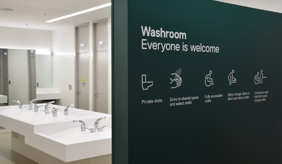
Inclusive washrooms. Image by hcma.
Integrating four distinct client groups
The end result brought together four distinct clients from the city—recreation, library, arts and parks— all accustomed to operating out of their own separate buildings. The library, for instance, has its own funding stream, reports to a separate board of directors, and holds different operating hours.
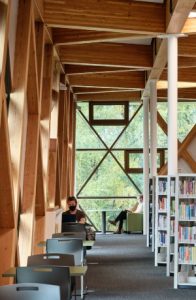
Inside the library. Image by doublespace.
Each client expected to co-locate and deliver their services separately, but quickly realized there wasn’t enough funding available to meet all needs.
“We worked with them to move away from this idea of siloed operational services to something more integrated and shared,” says Higgs. “It was a huge difference for this project, which was a surprising amount of work, both in the design and now in terms of thinking about the governance and operational structure of the building.”
The community’s desire for a large, non-programmed social space was one vision that pushed the clients to pool space and resources and relinquish some of their individual areas.
One of the largest barriers at community centres is being able to provide free space, says Higgs. “Libraries are fantastic at that, but for many community facilities there’s a lot of programming that exists behind a pay point.”
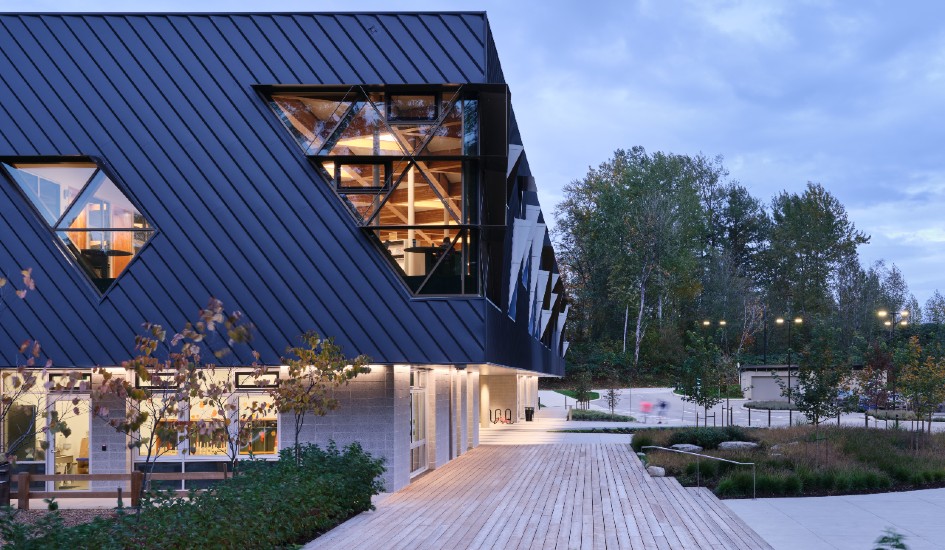
The main entrance to the library. Image by doublespace.
Mimicking a clearing in a forest, this atrium space is the first visual patrons see when they enter the building, inviting users to spend unlimited time, without pressure to engage in any programs.
In a fast-growing city where trees are disappearing, saving the forest on the facility’s land was a larger concern among community members. One of the most striking features of the building is the two-way glulam roof design, Higgs describes.
Resembling the veins of a leaf, the heavy timber structure mimics a tree canopy as a series of large-scale modular interlocking pinwheel units create a two-way wood structure spanning across large spaces.
Beneath the canopy, the civic centre brings forth visions from a suburban community that is uniquely dense and devoid of home garages and other spaces for making and fixing things, like a woodworking studio and community kitchen.
“The fact we could ask questions and see the building change in response to what we heard from the community was really exciting,” says Higgs. “That’s one of the ways of being inclusive—it’s not just getting them into the building physically, but what are the things in the building that allow them to be their best selves.”


