Something is popping at the latest collaborative workspace in Scarborough, Ontario, and it’s not just the sound of the sparkling water flowing right from the tap in the cafeteria.
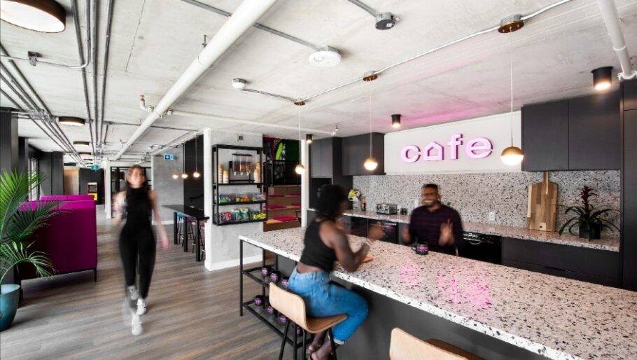
At Merge Spaces, ideas are bubbling. A vibrant mix of people brainstorm in the cafe while drinking bottomless coffees, learn breath techniques on Wellness Wednesdays, and celebrate victories by snapping content-worthy selfies with a “high five” mural in the corner—all in the course of a day’s work.
Those who have worked at home over the last while will understand the balance of comfort versus connection. Yes, it’s nice to be home and throw in the odd load of laundry—but you also miss interacting.
Merge Spaces has changed that. Each of the creators displays genuine excitement when talking about the project, which began with the vision of LCH Developments to bring something unique to the empty retail space on the ground floor of a condominium at 2229 Kingston Road in the growing community of Cliffside Village.
“LCH Developments decided to be different and creative,” said Carrie Pidgeon, Community Manager of Merge Spaces who has been with the project from the start. “It was just concrete, open space. I watched it develop and start to fill up—it’s my baby.”
Originally working with a single storey, LCH brought in RAW Design who transformed the space into a ground floor and mezzanine level to maximize the available space. “It doesn’t appear very low, but the ground floor is only eight feet high,” said Taylor Roth, interior designer with RAW Design.
To add character, RAW Design created offices with vaulted roofs, now branded with names like Cabin, Cottage, and Chateau,
“We came up with a visual of doing a peaked roof, so in came this house-like structure,” explained Roth. “In the background, LCH was coordinating with their marketing and branding team, and their logo came out and it was a little house. So, it all came full circle.”
The steady communication between the design team and the developers was appreciated, she added. “They (LCH) were cognizant of our opinions and kept us in the loop. It was clear they valued our opinion from a design point.”
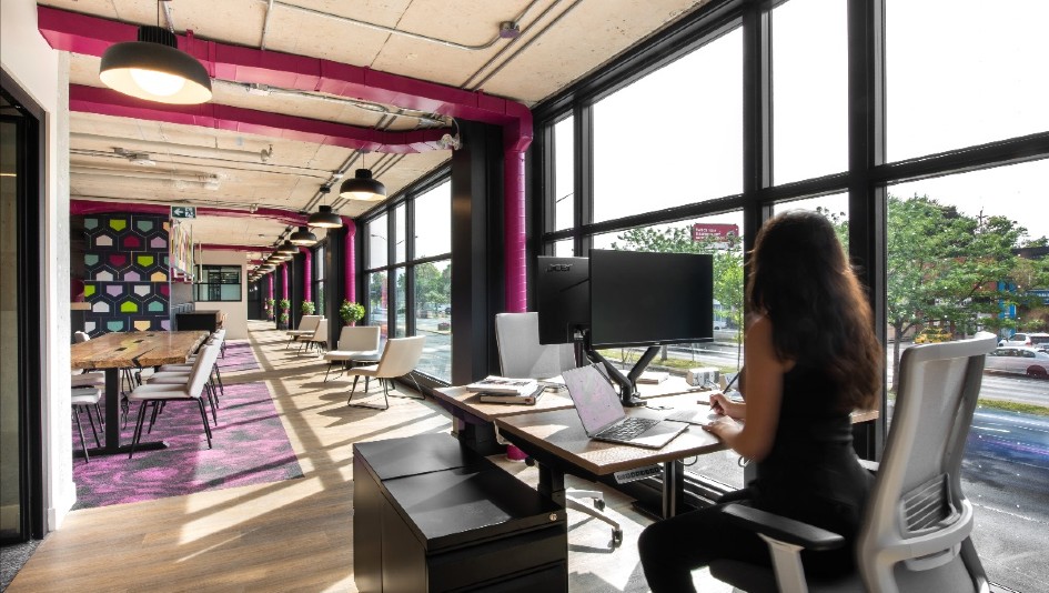
One of the initial challenges was disguising the ductwork and piping that weaved through the 22-foot high ceiling space. Blocking them in wasn’t an option, so they painted them magenta to match the Merge Spaces promotional colour schemes. “Very early on, our aesthetic was going to be neutral and warm, and then just to emphasize the ductwork,” said Roth. “We wanted to celebrate the thing which created our issues, so we came up with this beautiful magenta—a colour seen in their branding.”
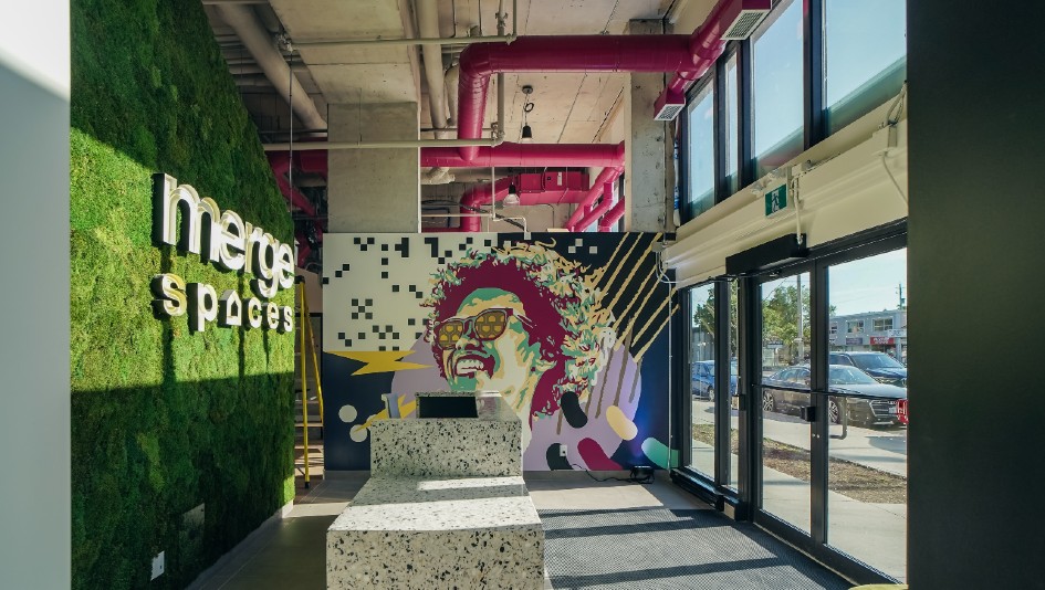
The space is balanced acoustically through the use of live moss walls attached to a sound buffering backdrop, and the space mixes clean, fluid lines with earth tones and custom-made maple harvest tables.
If you’re not too busy admiring the terrazzo concierge desk or stroking the moss wall behind it, you’ll likely be taking in one of the murals providing colour and energy. You may even notice Drake perched on the side of the Scarborough bluffs—a request which came from Carrie, the community manager, herself.
The series of twelve stunning visuals were created by Toronto-based artists Mel Coleman and Cesar Rodriguez, who partnered together to produce textured murals using a mix of collage, realism, and graphic elements.
“We wanted to create something cohesive for the space—something edgy and powerful,” said Coleman. “I’ve always loved collage, so we played with that and tried to come up with a variety of colour schemes with their branding, creating a dynamic kind of imaging.”
And there is no shortage of light streaming through the windows to show off the artwork. “We ended up redesigning the facade so that it would better connect with the street,” said Roth. “We orientated all the offices towards the front of the space while keeping the back of the space open to below. When you design for co-working, you are designing for multiple personalities and companies coming together in one space. Some people will want to sit in an open area and send emails on their laptop, and others will be a little more introverted and want to be in their closed office.”

COMMUNAL HARVEST TABLES AND SHARED DESKS IN THE WORKSPACE ENCOURAGE SPONTANEOUS INTERACTIONS AND BRAINSTORMING. PHOTO BY ARTHUR MOLA.
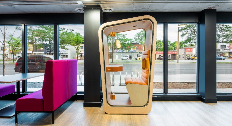
For those seeking complete audio privacy, pink soundproof pods provide a dedicated quiet space for making important phone calls. “They give someone confidence that what they are saying is in the confidence of the pod.”

BOOTHS ARE QUIET ENCLAVES TO RETREAT FOR HEADS-DOWN PRIVACY OR TELEPRESENCE. PHOTO BY ARTHUR MOLA.
When the lights go down, black light paint used by Cesar Rodriguez in the murals ignites features which can’t be seen in regular daylight.

TEXTURED MURALS ADORN THE LOBBY. LIVE MOSS WALLS BALANCE ACOUSTICS. PHOTO BY ARTHUR MOLA.
Currently using the workspace is a mix of tech start-ups, marketing and branding companies, and remote workers. LCH have also made it their head office.
Overall flexibility plays a prominent role in the project. Like other newly renovated workplaces in the past year, the hub encourages spontaneous social connections for those in between work moments. A games room is a place to mingle with other entrepreneurs and creatives.
The Treehouse is a presentation space by the café that holds lounge and booth seating. Workspace on the second floor is a mix of dedicated desks, communal harvest tables and shared desks that offer an office experience one might not find at home.
“It’s about creating that harmonious nature in an environment where it is strangers coming together and working together,” said Roth.
Judging by the hustle and bustle in the offices, the strategy seems to be working.
Sarah Farr is a writer, researcher and condo geek based in Hamilton, Ontario.
Feature photo by Arthur Mola.


