When the Arbutus Club wanted to refresh the interior of their restaurant, they turned to hospitality specialist Box Interior Design.
The design team led by principal Jay Brooks applied their signature attention to details to deliver a subtle and sophisticated aesthetic for the Fireside Restaurant that has won over the client and patrons alike.
“The new restaurant concept has been identified by members as the best capital project they have ever done. The project has inspired the club to look at more renovations to their other food and beverage venues,” says Brooks.
The Arbutus Club is one of Canada’s premier private members’ clubs and has been a landmark in Vancouver since 1964. To elevate the dated restaurant, the design team first addressed two key layout challenges in the existing 4,200 square foot space – the entry and the bar.
“There was this awkward waiting area with washrooms before you entered the restaurant proper. So we brought the start of the restaurant right off the common public corridor,” explains Brooks, adding washrooms were relocated from outside the restaurant space to inside and reconfigured as single person occupancy for a more sophisticated feel.
The bar was moved from the back to the middle of the space, just off the entry to create a hub of activity that did not exist before. The modifications create a better progression where guests enter through the condensed wine “library” with its dark and rich blue wall covering, into a larger reception foyer and then the restaurant.
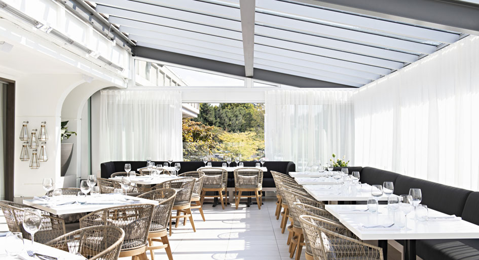
To better serve a varied demographic, the redesign divides the restaurant into three zones for different experiences: a quieter dining area on one side, a central bar and casual dining, and an enclosed patio. New pivoting mirrored screens provide zone delineation and flexibility without adding solid walls.
“We unified the zones by using the same drapery throughout the whole space as well as the dark wood wall,” says Brooks.
The articulated oak millwork also serves as a grounding element, set against soft, textural upholstery to create a warm and engaging visual statement. The purposely restrained palette evokes sophistication and elegance in every corner. The idea was to create an upscale, residential look and feel that is timeless, according to Brooks.

An open patio was fully enclosed in glass to provide a four-season experience. Operable glass walls allow for a breezy open feeling in the summer, while heated floors create winter comfort.
How light comes into the restaurant – plays off textures and materials – was an important consideration that drove the conceptual idea, says Brooks, noting the restaurant is located on the second floor of the club with lovely tree-lined views.
“The materiality and elements we used are quite simple and timeless. The palette is purposely restrained. We focused on the small details to create these moments like the wood paneling, ceiling design and mirrored screens,” he says.
The outstanding design earned the firm an IDIBC Award of Excellence and the prestigious Robert Ledingham Award for project of the year.
“It was a surprise,” says Brooks, who remembers Ledingham as a friend and mentor. “It’s always wonderful when your work is appreciated, and winning the award is personally meaningful since I started my career working for Bob.”
Cheryl Mah is managing editor of Design Quarterly.
Photos by Larry Goldstein


