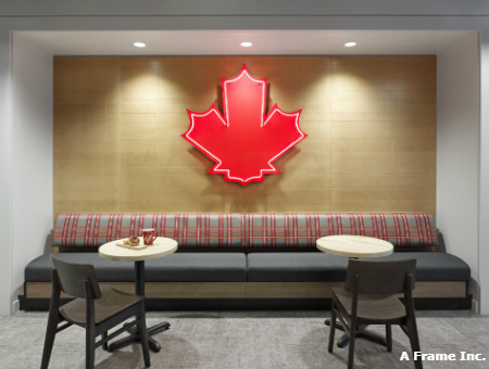
Panels of Canadian maple form a fitting background for a large, red-lit maple leaf in the cafeteria of Tim Hortons’ new head office, providing a visual representation of the company’s homegrown origins.
Tim Hortons, now one of North America’s largest quick-service restaurant chains, was founded in 1964 with a single location in Hamilton. For over 50 years, the company’s headquarters were located in Oakville, Ont., but the recent decision to move the office into downtown Toronto’s Exchange Tower was largely made to attract and retain top talent, including millennials and Gen-Zers. These demographic cohorts value walkability to neighbouring shops, restaurants and services, as well as access to public transit.
“It’s where the next generation of talent is and we recognize that. People want to live downtown and be close to transit and amenities, so that’s where we need to be. It’s something we’d been thinking about for some time and we finally made the move in early November,” said Jane Almeida, lead, brand communications at Restaurant Brands International, which owns the coffee chain.
Workplace social
 Tim Hortons has embraced a collaborative mentality in the new office, with cafés featuring community seating located throughout both floors of the 65,000-square-foot, Gensler-designed space. The café tables, chairs and booths, upholstered in the company’s signature red, white and dark grey palette, are identical to those found in restaurants and were crafted by Canadian suppliers using local materials. The mirroring of the restaurant’s design extends to the energy-efficient Viso LED lighting fixtures.
Workstation configuration was also selected to promote collaboration, as none of the approximately 400 employees, including executives, have offices. Instead, the bullpen is a bright, open-concept space arranged to welcome teamwork.
“We find a lot of team members take to tabletops for their meeting, or if they need quiet space to work, we find more and more that we’re moving away from desks and talking over coffee, ping-pong or foosball, and really using this open space,” observed Almeida.
From late spring to early fall, a private outdoor terrace furnished with Muskoka chairs will likely provide a change of scenery to the typical employee huddle. “A unique element to workplace design that is becoming more desired is access to the outdoors,” said Steven Burgos, design director at Gensler. “In the warmer months, employees will be able to use the terrace as an extension of the workplace, with outdoor meeting tables, lounge seating and Wi-Fi.”
Sustainable wellness
During the colder months, employees are still connected to nature year-round through plant boxes incorporated throughout the space. “Biophilic design elements help promote wellbeing in the workplace. Studies have shown this boosts productivity and health for employees,” noted Burgos.
For those employees wishing for more privacy, board rooms and focus rooms with names like Double-Double or Chocolate Dip can be booked through an online reservation system. These rooms were kept off the window line to provide all employees with access to natural daylight and outdoor views from their workstations, which has been shown to increase productivity, engagement and overall wellness.
Visitors to the office, which is located on the former TSX trading floor of the building, are greeted with an exposed brick wall in dark grey behind the reception desk, reminiscent of a modern, well-designed home, complete with coordinating Teknion lounge seating.
Teknion, which also supplied all the employee workstations, manufactures its products in Toronto out of approximately 70 per cent recycled content. Workstations are topped off with ergonomic task chairs by Knoll, which contain about 40 per cent recycled content.
Gensler enlisted Interface, which uses a high degree of recycled material in its products, to supply the majority of the flooring for the office, including the carpeting in the lobby.
A wood and glass staircase forms a centrepiece of the reception area. “An existing staircase became a new feature element in the space with a little paint and re-finishing. By retaining the stair, employees are encouraged to walk between floors, promoting movement and wellness and reducing demand on the elevators,” said Burgos.
The move from the Oakville office saw employees move into a greener mindset. For one, the organization has, for the most part, gone paperless. For any employees that require a printed document, there are designated copy and print locations on the floor.
Although the Tim Hortons name is synonymous with coffee served in trademark red paper cups, the company has made moves to cut down on other waste it produces by providing all employees with their own branded water bottles and mugs to refill hot and cold beverages from over 20 coffee and tea stations dotting the space. Further, trash, recycling and composting (for coffee grounds) areas are offered in centralized locations to discourage needless waste.

“By centralizing services such as trash and recycling, coffee points and the creation of a large communal café, this promotes a culture of movement within the space and creates opportunities for chance encounters and socialization amongst employees, which we have found in our workplace survey research boosts productivity and innovation,” added Burgos.
Creating connections
Furthering its references to its hockey origins, the office was designed in the shape of an ice rink. Located right at ‘centre ice,’ the heart of the office, sits a state-of-the-art test kitchen. Its central location allows employees to feel a connection to the products being developed. In addition, all the food and beverage technology and equipment in the office is exactly what can be found at the restaurants.
“It would be crazy to have a Tim Hortons headquarters in downtown Toronto and not have a test kitchen,” said Almeida. “This is where all the flavours come to life.”
Tributes to the company’s heritage and its founder, as well as touchpoints illustrating the company’s bean-to-cup story and community outreach initiatives, are peppered throughout the entire office, ranging from Tim Horton’s original Toronto Maple Leafs hockey jersey hanging on a lattice wall in the main lobby, to vintage photos featuring Horton himself from the first restaurant in Hamilton.
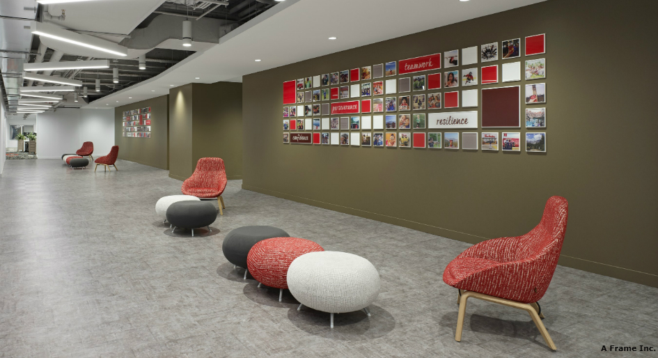
Near the test kitchen is a wall dedicated to social media posts from restaurant guests, which is one of Almeida’s favourite features of the new office. The social media wall provides a tangible demonstration of how Tim Hortons’ consumers connect with the brand.
“It represents the connection Canadians and our guests have with Tim Hortons from coast to coast to coast,” said Almeida. “The photos celebrate the role that Tim’s has played in Canadians’ special moments and memories across the country.”
Kavita Sabharwal-Chomiuk is the editor of Canadian Facility Management & Design.


HI there – great article and a fine looking workplace. Do you know who Gensler and the PM used to ensure both ergonomics and accessible design were part of the project? For example were any People with Disabilities part of the design process?