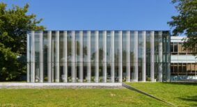
When rental company Park Property Management (PPM) required an additional office, it searched its apartment inventory. It unearthed 2,000 square feet perched atop a north Toronto building, 15 storeys up. Long forgotten, the penthouse had been relegated to a storage depot, stashed with cleaning supplies, gym equipment and the superintendent’s found treasures. PPM called on Quadrangle Architects’ Interiors Group to see if there was any hope for its rehabilitation and conversion to a workplace.
When the designers walked into the space, they immediately saw potential. With its concrete folded plate roof, open span, and enveloping daylight, it was evident that it had good bones. Unfortunately, it served as little more than a glorified broom closet. “This is wonderful!” stated principal and interiors group lead, Caroline Robbie. “How could (one) have been sitting on this for so long and not done anything with it?”
Having outgrown its current digs, PPM needed to manage some 12 buildings from this location. The program was simple: two private offices, workstations for a small number of staff, file storage, a meeting area, a kitchen, and a space to greet visitors. PPM also wanted the flexibility to grow.
Completed in November 2013, the project didn’t involve a great deal of building; the space was mostly in desperate need of a clearing out and freshening up. Original inherited features including the terrazzo floor and radiators were retained, and the exposed concrete folded plate ceiling was stripped of random adhesive tiles and clad in drywall. Small storerooms were demolished and an updated HVAC system was installed. The biggest ticket item was the perimeter’s total window replacement, which in turn had a positive effect on light quality and energy efficiency.
The design direction for the interiors was borne of the building’s early 60s vintage and the space’s strong architectural language: align the interior design with the architecture by emphasizing its mid-century modern heritage. Walnut veneer is used in the millwork, extending to the furniture and accessory pieces, while accent details are co-ordinated in black or satin bronze finish, right down to the tiny tapered cabinet pulls.
The new Mad Men-inspired office blends commercial and residential; PPM, after all, is in the business of where people live. Just as building superintendents and managers come to the office to discuss operations, tenants come to sign leases or negotiate sublets. “We wanted to give it a warm, residential feel, but without seeming false, folksy or artificial,” Robbie said.
Visitors step off the elevator into an intimate vestibule, only seven feet in height. A wiry carpet recalls an entrance mat and the painted black walls are adorned with an overlay of repeating company logos in gold leaf, simulating custom wallpaper. Period-correct wall sconces complement the residential aesthetic.
From there, the low ceiling gives way to reveal a light-filled and lofty open plan space peaking at 12 feet. Simple white lighting fixtures hang overhead. Underfoot, carpet tiles are grouped to resemble area rugs, picking up green, grey and brown tones of the terrazzo flooring.
The waiting area, more akin to a living room, is distinguished by a carefully curated collection of signature Eames pieces: lounge chair, coffee table and compact sofa. This classic design furniture by Herman Miller is mixed with a row of crisp white contemporary workstation systems tucked under the profiled ceiling, channeling a retro feel. “It resonates with a certain generation of people but it still looks modern. To me, modernism still looks fresh — it doesn’t look dated,” Robbie said.
Two private corner offices follow. The remaining open area has a meeting space with bright orange Eames shell chairs and banks of files. The area can easily be added to or reconfigured. A kitchen and powder room complete PPM’s new office.
File storage was a priority. Going paperless is a growing trend, with many workplaces now managing information electronically. But the rental industry, with its paper-based origins, is in a transitional phase. Leases are still penned and copies must remain on site as long as leases are active, amounting to loads of paper records. With that in mind, designers stacked some filing cabinets three high and turned them into work surfaces. They also arranged some filing cabinets singly, so the cabinets can double as upholstered benches. Kept low, they don’t create a wall, visually or practically. “We tried to do it in a way that the stuff didn’t get in the way of the people,” Robbie said.
And where they could refurbish, they did, often with a sense of whimsy. A 60s Sputnik chandelier was re-appropriated from another property, and a glitzy pinball machine reinvented by one of the company’s owners was placed upright as artwork.
The renewed interior not only makes more efficient use of the real estate, but it offers a highly functional and comfortable workplace where one had not been envisioned.
“A building’s lifespan has to grow and change over time,” Robbie said. “As a designer, you’re seeing its attributes and its potential where someone else might not.”
Stephanie Calvet is a Toronto-based registered architect and a writer specializing in architecture and design. She has 11 years’ experience working in architecture and planning firms in Boston, designing projects in the hospitality, multi-unit residential, education and healthcare sectors.
Photo by Bob Gundu.


