Located in the heart of downtown Vancouver, the Fairmont Waterfront Hotel is well known for offering guests breathtaking views of the surrounding coastal mountains, harbour water and urban skyline.
Now the eye-catching view is not only on the outside. The hotel recently underwent a much needed renovation that has resulted in a modern and elegant decor that reflects its enviable location and the luxury hotel brand‘s distinctive services.
Vancouver based B+H Chil Design led the extensive renovation which involved the redesign of the guestrooms, corridors, the Gold Lounge, the fitness facility and the existing restaurant.
Work on the guestrooms, fitness and gold lounge renovation design work began in February 2012 and was completed in September 2013. Renovation of 75 per cent of the 489 rooms was completed in 2013 while the remainder of the rooms will be complete by the end of 2014.
“It had been awhile since the last renovation and the rooms were quite overdue for a refresh,” says Adele Rankin, who was the lead interior designer and a senior associate at B+H Chil Design.
Not only was the property starting to show its age, but it was also facing increased competition from new and renovated hotels in the downtown market including its own sister property down the street, the Fairmont Pacific Rim.
Opened in 1991, the Fairmont Waterfront is one of four Fairmont properties in Vancouver and one of two on the water.
The design concept was to respect the Fairmont prestigious brand while capturing a distinct West Coast aesthetic to differentiate the hotel.
“The location plays a key part for this property,” says Rankin, noting most of the rooms feature floor to ceiling windows. “Many of the rooms have these fantastic views of the North Shore Mountains, the harbour and cruise ships so we really want to ensure we gave the guests a West Coast experience.”
Taking aesthetic inspiration from the waterfront location, the design team used luxurious fabrics and timeless detailing to convey a contemporary elegance. A warm, regional colour palette and local photography in the guestrooms were used to create a sophisticated West Coast sense of place.
The complete redesign of all guestrooms incorporates unique colour schemes – two for the Fairmont guestrooms, and another for the distinct Gold rooms.
The Fairmont Gold guestrooms, on the 8th and 9th floors, were completely refurbished including re-modelled bathrooms and a new design for the private lounge and patio. The boutique “hotel within a hotel” offers guests exclusive privileges such as concierge service
“In the Gold rooms, we wanted to create an elevated level of luxury,” says Rankin. “So the rooms have a palette that is quite moody with warm greys, deep hazy mauves and rich chocolates. And we chose a very large graphic carpet.”
Warm and inviting, the Gold rooms feature custom-designed case goods by St. Damas in marble and deep chocolate tones. All custom lighting was provided by Garo.
“For the credenza, desk, luggage bench, we custom designed an integrated system so it’s all seamless,” says Rankin.
The most striking feature of the new rooms is a feature headboard wall covering with graphic patterns in silver and dark tones. Adding to the grand statement in the rooms are oversize upholstered headboards for the beds.
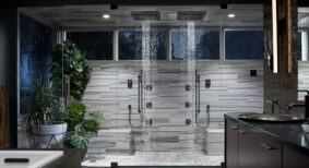
For the bathrooms, they were completely re-done as well with new vanities, marble counters, marble floor tile and surround. Swing doors were replaced with sliding barn style doors and most rooms now feature seamless glass enclosed spa showers.
“We introduced in all of them floor tile at the entry so when you come into your room, you feel that extension of the bathroom. It makes the bathroom feel that much bigger,” says Rankin, adding another unique feature is the seamless TV located in the lit floating vanity mirror.
In the Fairmont rooms, they were refreshed with two colour palettes – soft gray/blue and creamy caramel – intended to be light and airy.
“Again everything in those rooms is brand new with the colours much lighter and creamier with touches of copper tones,” she says.
The other major component of this project was the significant transformation of the existing restaurant in the lobby into the new ARC Restaurant + Bar, drawing its name from the uniquely curved space. Construction started in November 2013 and the restaurant officially opened in May 2014.
“We darkened the restaurant significantly,” says Rankin to add interest and depth against the ample amount of natural light coming through the floor to ceiling windows. “We have these great blackened aged wood floors, very dark wall covering, feature black and gold walls and dramatic lighting – sculptural wood lighting.”
To achieve a more lounge atmosphere to draw people into the restaurant, the bar was moved and redesigned with a dramatic herringbone aged black wood covering the bar facade and a soft mauve pink bar top.
“The bar previously was on the upper level where people were strangely facing away from the view,” says Rankin. “Now we’ve centralized the bar, a semi-curved area where people can gather and grab a drink.”
The design also created new areas such as a chefs table and introduced a variety of seating styles from banquettes and communal tables to high top tables and lounge furnishings.
How to deal with the high volume of space and working within the existing structure of the room were the main challenges, according to Rankin, which required creative reconfiguring.
“We had to figure out how to shoehorn a new bar into that area so that it would work both operationally and aesthetically,” she says. “We were also restricted with the division of the lower and upper sections.”
The $12 million transformation has reinvigorated the popular hotel with a new, contemporary look which is drawing positive feedback.
“This was a complicated multi-level project and we had a great group of designers that worked diligently to make sure it would deliver a positive outcome for Fairmont,” says Rankin, who is currently working on the renovation of the iconic Fairmont Empress in Victoria. “We’re really proud of it. It’s warm and inviting and classically Fairmont.”
Cheryl Mah is managing editor of Design Quarterly.


